© João Mourão, 2026. All Rights Reserved | Typeset in Montserrat and PT Serif.
🟢 Available for new projects

© João Mourão, 2026. All Rights Reserved | Typeset in Montserrat and PT Serif.
🟢 Available for new projects
🟢 Available for new projects
Blue Frontier
Blue
Frontier
Blue
Frontier

Blue Frontier was developed as a concept for a three-day defense and security summit in Lisbon, bringing together the Portuguese Navy and Air Force around Aero-Maritime innovation, logistics and emerging military technologies.
The goal was to create more than an event identity. The project explored how a single visual system could extend across the event's digital presence, printed communication, signage, identification and physical environment.
Blue Frontier was developed as a concept for a three-day defense and security summit in Lisbon, bringing together the Portuguese Navy and Air Force around Aero-Maritime innovation, logistics and emerging military technologies.
The goal was to create more than an event identity. The project explored how a single visual system could extend across the event's digital presence, printed communication, signage, identification and physical environment.
Blue Frontier was developed as a concept for a three-day defense and security summit in Lisbon, bringing together the Portuguese Navy and Air Force around Aero-Maritime innovation, logistics and emerging military technologies.
The goal was to create more than an event identity. The project explored how a single visual system could extend across the event's digital presence, printed communication, signage, identification and physical environment.

Role
• Brand Identity
• Graphic Design
• UI Design
• Event Planning
• Website Design
Role
• Brand Identity
• Graphic Design
• UI Design
• Event Planning
• Website Design
Role
• Brand Identity
• Graphic Design
• UI Design
• Event Planning
• Website Design
Research & Direction
Research
& Direction
Research
& Direction
The visual direction was developed through research into the Portuguese Navy and Air Force, their history, symbolism and operational context. I wanted the identity to feel contemporary without losing its connection to Portugal's maritime heritage.
The visual direction was developed through research into the Portuguese Navy and Air Force, their history, symbolism and operational context. I wanted the identity to feel contemporary without losing its connection to Portugal's maritime heritage.
The visual direction was developed through research into the Portuguese Navy and Air Force, their history, symbolism and operational context. I wanted the identity to feel contemporary without losing its connection to Portugal's maritime heritage.


Two elements became central to the identity: the caravel, representing the Navy and Portugal's maritime history, and the three feathers referencing the Air Force's eagle.
Two elements became central to the identity: the caravel, representing the Navy and Portugal's maritime history, and the three feathers referencing the Air Force's eagle.
Two elements became central to the identity: the caravel, representing the Navy and Portugal's maritime history, and the three feathers referencing the Air Force's eagle.


Identity
Identity
Identity
The identity combines naval and aerial references into a single mark. The caravel represents the Navy, while the three feathers reference the Air Force's eagle, creating a symbol that connects both organisations within one identity.
The identity combines naval and aerial references into a single mark. The caravel represents the Navy, while the three feathers reference the Air Force's eagle, creating a symbol that connects both organisations within one identity.
The identity combines naval and aerial references into a single mark. The caravel represents the Navy, while the three feathers reference the Air Force's eagle, creating a symbol that connects both organisations within one identity.

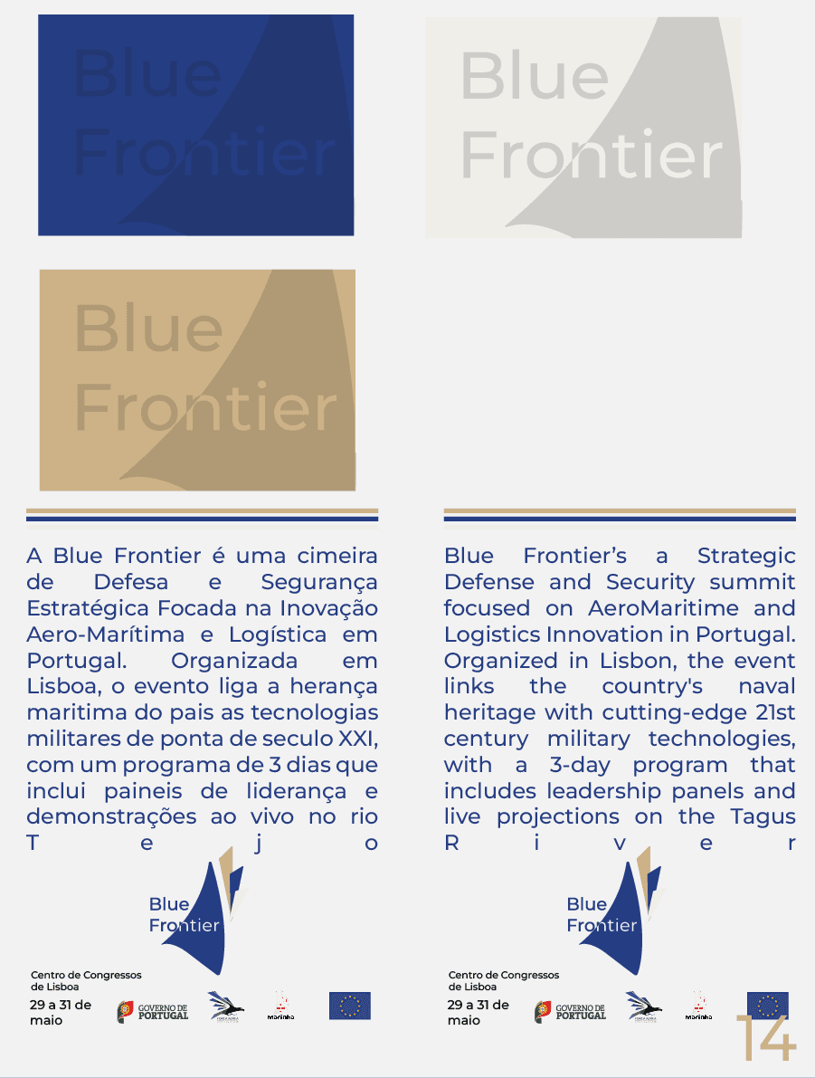
The colour system was also used as an organisational tool throughout the event:
white identified Air Force-related elements,
blue identified Navy elements
gold identified staff
The colour system was also used as an organisational tool throughout the event:
white identified Air Force-related elements,
blue identified Navy elements
gold identified staff
The colour system was also used as an organisational tool throughout the event:
white identified Air Force-related elements,
blue identified Navy elements
gold identified staff
System
System
System

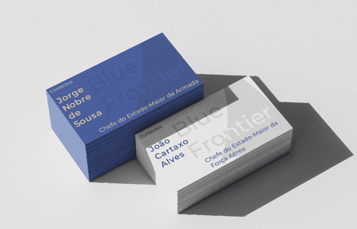
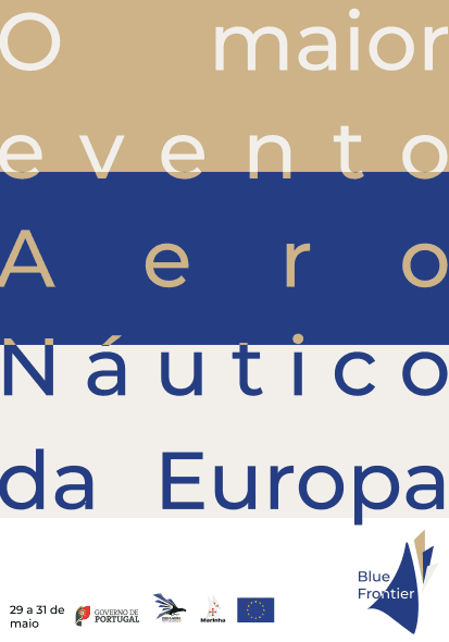


The identity was designed as a modular system rather than a collection of individual pieces. The same visual language was adapted across promotional material, identification, signage and digital communication while maintaining a clear hierarchy between different event functions.
The identity was designed as a modular system rather than a collection of individual pieces. The same visual language was adapted across promotional material, identification, signage and digital communication while maintaining a clear hierarchy between different event functions.
The identity was designed as a modular system rather than a collection of individual pieces. The same visual language was adapted across promotional material, identification, signage and digital communication while maintaining a clear hierarchy between different event functions.
Digital Experience
Digital Experience
Digital
Experience


The website prototype was designed as the main digital entry point to the event, bringing together information about the programme, speakers, tickets and venue while maintaining the visual language established by the identity.
The website prototype was designed as the main digital entry point to the event, bringing together information about the programme, speakers, tickets and venue while maintaining the visual language established by the identity.
The website prototype was designed as the main digital entry point to the event, bringing together information about the programme, speakers, tickets and venue while maintaining the visual language established by the identity.
Designing
the Event
Designing
the Event
Designing
the Event
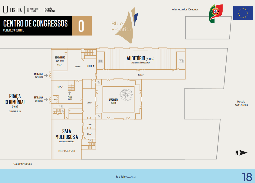


The project extended beyond the visual identity into the planning of the event itself. I developed the programme, room allocation, visitor categories, ticketing and supporting materials to make the concept function as a coherent event rather than simply a visual exercise.
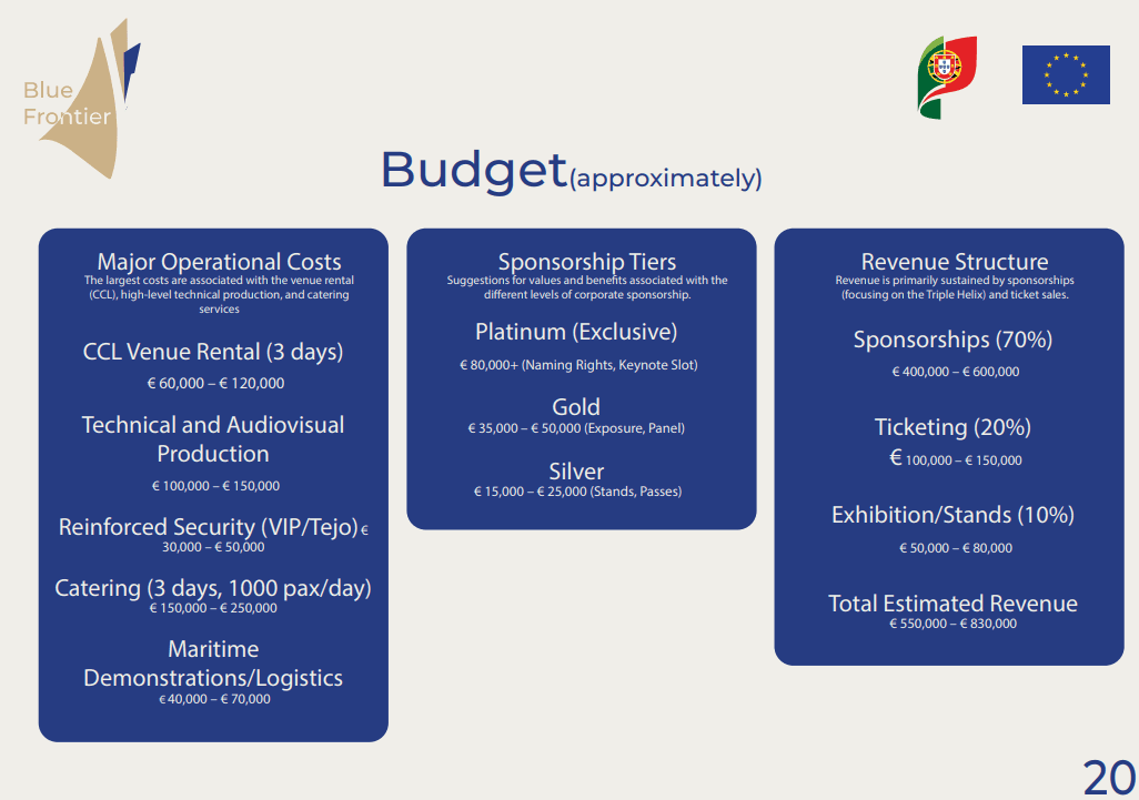
Because the project was developed as a complete event concept, I also worked through its operational side, including venue planning, scheduling, sponsorship and budgeting. The objective was to make the concept internally consistent beyond its visual presentation.
The project extended beyond the visual identity into the planning of the event itself. I developed the programme, room allocation, visitor categories, ticketing and supporting materials to make the concept function as a coherent event rather than simply a visual exercise.
Because the project was developed as a complete event concept, I also worked through its operational side, including venue planning, scheduling, sponsorship and budgeting. The objective was to make the concept internally consistent beyond its visual presentation.
The project extended beyond the visual identity into the planning of the event itself. I developed the programme, room allocation, visitor categories, ticketing and supporting materials to make the concept function as a coherent event rather than simply a visual exercise.
Because the project was developed as a complete event concept, I also worked through its operational side, including venue planning, scheduling, sponsorship and budgeting. The objective was to make the concept internally consistent beyond its visual presentation.
Reflection
Reflection
Reflection
Blue Frontier was one of the first projects where I had to think beyond individual deliverables. Designing the identity was only one part of the process; every graphic, interface and physical element had to work within the same system and serve a purpose within the event.
The project pushed me to combine research, branding, digital design, print and event planning into one coherent outcome.
Blue Frontier was one of the first projects where I had to think beyond individual deliverables. Designing the identity was only one part of the process; every graphic, interface and physical element had to work within the same system and serve a purpose within the event.
The project pushed me to combine research, branding, digital design, print and event planning into one coherent outcome.
Blue Frontier was one of the first projects where I had to think beyond individual deliverables. Designing the identity was only one part of the process; every graphic, interface and physical element had to work within the same system and serve a purpose within the event.
The project pushed me to combine research, branding, digital design, print and event planning into one coherent outcome.